How to Use Data Visualization for Fitness Progress Insights
Monitoring one’s fitness journey can often feel overwhelming, yet data visualization transforms this complex process into something manageable and insightful. By taking various metrics, such as weight, body fat percentage, and exercise frequency, visual tools can help to convey this information clearly. With the right approach, one can easily notice patterns, track progress over time, and make informed decisions. For intimacy with the data, you might consider setting personal goals and visualizing these metrics continuously. Including not just numbers but also graphs and charts assists in putting your progress into perspective. A modern dashboard can summarize numerous metrics in a digestible format, giving you quick revelations about your fitness journey. This enables a visual comparison to prior weeks or months, detailing if any strategies you’ve implemented are working. Moreover, such visualizations can heighten your motivation, igniting determination to stay active and aligned with your goals. This visualization approach fosters a sense of accomplishment as the graph indicates movement towards your defined objectives.
Essential Metrics for Visualization
To create effective data visualizations for tracking fitness progress, it’s crucial to identify the essential metrics to include. Each detail contributes uniquely to the overall picture of health and wellness. These may encompass metrics like your weight, workout frequency, calories burned, and muscle gain. Monitoring your heart rate during workouts shines a light on cardiovascular health, revealing how efficiently your body functions during exercise. Tracking sleep patterns is also vital, as they significantly contribute to recovery and performance. You could include flexibility and endurance measurements by assessing the number of repetitions you can perform over time. Making a comprehensive list not only assists in visual clarity but also ensures you don’t overlook critical aspects. With tools such as spreadsheets, software, or apps available, entering data becomes a seamless practice; this ensures your data visualizations reflect accurate and current status. By refining your metrics list, you will possess a clearer path towards achieving your fitness ambitions, utilizing your visual tools effectively.
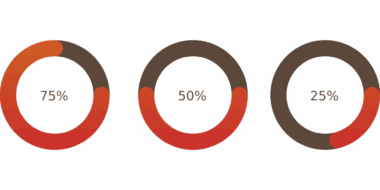
Once essential metrics are defined, employing the right visualization tools is paramount. Various applications and software are designed to convert raw data into engaging graphs, charts, and visual displays. Popular options include fitness apps enabling you to track progress through visuals and integrate with wearables. Tools like Tableau or Microsoft Excel offer in-depth capabilities, allowing for the creation of custom charts that accurately convey your journey. Using pie charts can represent body composition percentages, while line graphs might illustrate changes in weight per week. For those looking for convenience, numerous mobile applications are available that seamlessly integrate with smartphones and fitness trackers. These applications often give real-time feedback, meaning you could monitor your progress after every workout. Additionally, many of these tools include features for goal setting and alerts, keeping you engaged and accountable. Having such a simulation on your mobile device not only offers accessibility but brings timely insights that enhance your fitness experience and journey.
The Importance of Regular Updates
Creating and maintaining visualizations requires consistent and regular updates; without this, the data becomes outdated, rendering it ineffective. Setting a schedule for updating your data ensures that all changes and trends are documented accurately. This could be a weekly or bi-weekly ritual that helps keep you aware of how actions correlate with outcomes. For example, entering weight changes, workout duration, or any personal milestones can significantly influence your progress graphs. The frequency of updates allows for easy observation of trends or abrupt changes that require attention. Utilizing visualization tools that notify you or help you schedule updates can ensure you do not overlook this task. Additionally, turning updates into a motivating activity makes the process more enjoyable, offering immediate insights into ongoing efforts. The act of logging information and adjusting your visualizations provides a sense of ownership over your fitness journey, showcasing achievements as they arrive over time, thus fueling motivation.
Another essential aspect is assessing your visualizations periodically to decipher patterns and trends. Evaluating data visually allows for insights into how adjustments or efforts have impacted results. Gaining this perspective can lead to informed decision-making and enhanced fitness strategies. By analyzing your progress outputs, you may identify specific workouts yielding better results or discover how nutrition impacts overall performance. Spotting areas where change is needed can help mold workout regimes better suited to your needs. Furthermore, regularly reviewing these insights encourages awareness of progress, no matter how minimal it may appear at times. This awareness can foster a more positive outlook towards the fitness journey, ensuring that perceived plateaus do not discourage continued efforts. The deeper understanding derived from visualization enables better alignment with personal fitness goals and provides insight into necessary modifications that enhance the experience. A regular assessment routine will promote growth, adaptability, and better fitness outcomes.
Creating Meaningful Goals
A crucial component of utilizing data visualization for fitness is establishing meaningful, achievable goals that resonate with personal aspirations. Defining these goals creates a roadmap that guides your fitness efforts, while visualizations oftentimes serve as motivational reminders. Goals can be anything from weight loss targets to training for specific events like marathons or weightlifting competitions. By categorizing goals into short-term and long-term objectives, you create layers of achievement that can be tracked. Visualizing each step enables you to celebrate smaller victories that contribute to larger successes. When goals are represented visually, tracking progress becomes not only easier but much more fulfilling. As one follows through on actionable steps, being able to visibly see progress transforms loading feelings of doubt into pride. Moreover, sharing these goals and visualizations with others may create a supportive environment for accountability and encouragement, enhancing overall perseverance in the fitness journey. Ultimately, goal visualization leads to greater clarity, motivation, and heightened awareness of your progress.
In conclusion, leveraging data visualization is an effective and empowering method for tracking and monitoring your fitness progress. It simplifies complex metrics into engaging visuals, making fitness journeys more observant and insightful. Through identifying essential metrics and utilizing the right tools, one can keep active tabs on their wellbeing. Regular updates and assessments ensure all data stays relevant, advocating a dynamic approach to fitness. Importantly, establishing meaningful goals aligns aspirations with reality, fostering a sense of ambition. Visualizations bring forth an accountability factor, motivating ongoing engagement and creating a positive relationship with fitness. Finally, it’s important not to forget the benefit of focusing on the journey—often, it’s about improvement rather than perfection. Remember to appreciate even the smallest victories along your path to success and personal development.
Embracing the practice of data visualization in your fitness regimen not only enhances understanding but ultimately supports long-term wellness goals.