Avoiding Common Mistakes When Visualizing Fitness Data
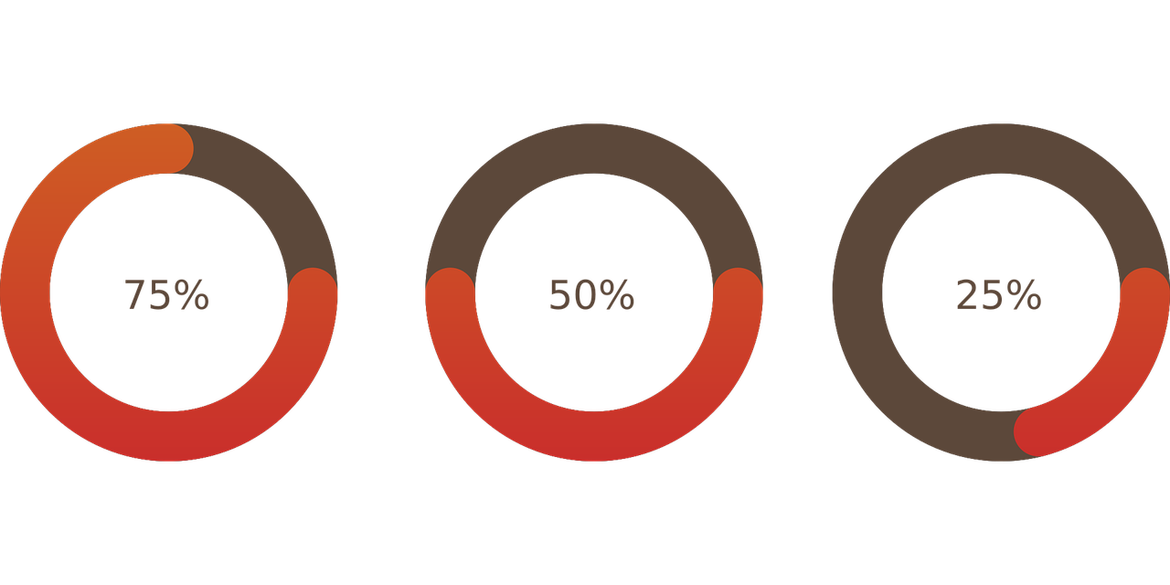
Visualizing fitness data can present numerous challenges, especially when beginners attempt to create meaningful charts. One common mistake is using inadequate scales for the axes. If scales are too small or too large, they can distort perceptions of trends. For instance, a small change in weight over time can look extravagant if plotted on an oversized scale. On the other hand, adding too many data points may overcrowd the chart, making it difficult to identify patterns. Stick to key metrics that reveal performance insights, such as weight lifted or running distance, and maintain clear scaling. A second common issue is neglecting to update visualizations regularly. If you only track data sporadically, visualizations may fail to provide an accurate representation of progress. Regular updates keep you motivated and allow for meaningful adjustments in your fitness routines. Thirdly, consider the choice of chart types. Choosing a pie chart for showing progress percentage might seem interesting but can lead to challenges. Instead, line graphs or bar charts often deliver clearer results in highlighting changes and achievements over time. Learn how to best showcase your fitness journey through well-structured visualizations.
Another notable mistake is failing to include context in your charts. When presenting fitness data, it’s essential to provide accompanying information that supports the visual representation. For example, including the specific workout routines during a weight loss phase can clarify why certain weight changes occurred. Without context, viewers may interpret the data incorrectly. Furthermore, using too many colors or styles may distract readers from the message you want to convey. Stick to a consistent color palette that aligns with your brand or theme, ensuring it remains visually appealing yet informative. Additionally, ensure your charts are legible. Too-small fonts or intricate designs may necessitate zooming, which detracts from the experience. Use a straightforward design to facilitate easy reading. The legend is another crucial element that must be consistently updated. If you frequently change metrics, like using different exercises or altering rest times, ensure that the corresponding legends adjust too. Misleading legends can lead individuals to believe they are showcasing distinct data, resulting in confusion. Finally, remember to share your visualizations across platforms. Posting on social media or blogs can inspire others to achieve their fitness goals. Elevate engagement with regular updates.
Importance of Consistency in Data Tracking
Consistency is paramount when visualizing fitness data effectively. Without reliable tracking methods, you run the risk of creating misleading charts that do not reflect your true progress. For instance, if you only log data once a week, you might miss out on essential changes occurring daily. It would distort the actual trends in your fitness journey. Consider using apps or software designed for fitness tracking to simplify this process. Regular updates allow you to have more accurate representations of your day-to-day efforts. Furthermore, always cross-check your data entries. Errors when inputting information will lead to discrepancies in your visualizations. Mistakes, such as typing the wrong weight or workout duration, produce misleading charts, diverting attention from progress made. Once you have a strategy for data collection, aim to set specific and attainable goals. This method gives your visualizations clear purpose, helping in gauging performance levels meaningfully and keeping you motivated. When your goal is quantifiable, it’s easier to visualize the journey toward achieving it. Therefore, always aim to create an environment of positive reinforcement, harnessing the power of visualization as motivation to continue your fitness endeavors.
Another area to keep in mind when visualizing fitness data is the importance of simplification. While complex graphs can seem impressive, they often lead to confusion rather than clarity. Simplifying the data presentation allows viewers to grasp the essential information instantly. For example, a comparison chart between running speeds is more useful if presented clearly instead of overly complicated analyzers that can confuse casual observers. Remember that different stakeholders may view your visualizations. Tailor your charts according to your target audience. If your workout group is not data-savvy, opt for simple, intuitive designs. Always remain open to feedback from peers regarding the visualizations shared. Their insights may highlight areas you might overlook in your personal assessments. Another factor to consider is the timing of your visualizations. Plotting data immediately after a workout may lead to enthusiasm-driven misinterpretations, while observing trends over a prolonged period sheds light on realistic progress. Therefore, evaluate steps taken and compare them over defined intervals, allowing a more thorough understanding. This method not only aids in accuracy but can reveal long-term habits essential in achieving goals.
Leveraging Technology for Better Visualizations
Leveraging technology can significantly enhance your capacity for visualizing fitness data. Various applications and software provide vast ways to collect and visualize data in engaging formats. Many fitness apps can automatically generate diagrams and statistics for users, eliminating manual input errors that may occur. Utilizing tools such as Excel or Google Sheets enables you to customize your charts further, integrating your preferred metrics efficiently. These programs offer various graph types to choose from, letting you find the one that resonates most with your fitness objectives. Furthermore, online platforms can facilitate sharing visualizations within communities. Consider collaborating on platforms such as social media where others can learn from your efforts and strategies. Visual feedback from peers may even provide insights to improve your workout approach. Additionally, if you’re tech-savvy, explore wearable fitness trackers providing real-time data analytics. This technology can seamlessly connect with your visualizations, offering a comprehensive view of your fitness journey. Regularly analyze the data output from these devices to spot patterns that inform your training regimen better. Over time, you’ll likely find your fitness visualization becomes an advantageous tool, pushing you toward achieving your desired results.
Lastly, remember that change is an integral part of visualizing your fitness data. People experience fluctuations in progress due to various factors such as seasonal changes, psychological aspects, and nutritional habits. If you suddenly experience a plateau, captivate its reasons with your visualizations. Ultimately, they reflect your hard work and adaptation. Therefore, adopting a flexible approach toward interpreting the information and adjusting your goals as circumstances shift is beneficial. The key is to embrace a balance between consistency and adaptability. Encourage yourself to make the necessary changes, whether that means altering your routine, incorporating new exercises, or re-evaluating your goals. Make room for nuances such as temporary setbacks. Acknowledge that they exist as part of the learning process and growth as an athlete. Celebrating small wins and incremental improvements is essential, reminding you to stay motivated throughout the journey. In conclusion, while it can be tempting to aim for seamless progress visualizations, recognize that life is dynamic, and so is fitness. Incorporate these insights into your approach, allowing your visualizations to promote growth, understanding, and continued inspiration for achieving your ultimate fitness goals.
In summary, navigating the world of fitness data visualization involves awareness and proactive strategies. As you’ve learned through these sections, avoiding common pitfalls requires intentional tactics focused on clarity, context, and technology. Regularly updating metrics, simplifying presentations, utilizing trustworthy software, and being adaptable will serve you greatly on your fitness journey. While visualizations help keep motivation high, always remember that they should maintain accuracy. Tailor your presentations according to your audience and connect with platforms that allow sharing progress efficiently. Ultimately, the path to achieving your fitness goals can be enhanced and supported through effective visualizations. Monitor your journey with intention and use these insights to reflect and motivate yourself toward future achievements. In the realm of fitness, every effort counts, and with diligent and thoughtful visualization practices, you can maximize your potential and overcome common challenges. Embrace the data and turn it into meaningful progress. Good luck with your fitness endeavors as you visualize and navigate your path toward success and wellness.